If Your Website Sucks, It Won’t Convert

Where’s that bacon my site promised?
Get a website, they said. It will bring customers, they said. But it’s not. Why? Put simply: if your website sucks, it won’t convert.
There could be a lot of reasons to explain why a website isn’t pulling the pork. It could be that you have poor or even no content besides a home page. It could be an “artistic” design choice. Or it could be difficult to navigate with a complicated or confusing site structure. But they all come down to the same thing; if your website isn’t converting, it’s because it sucks.
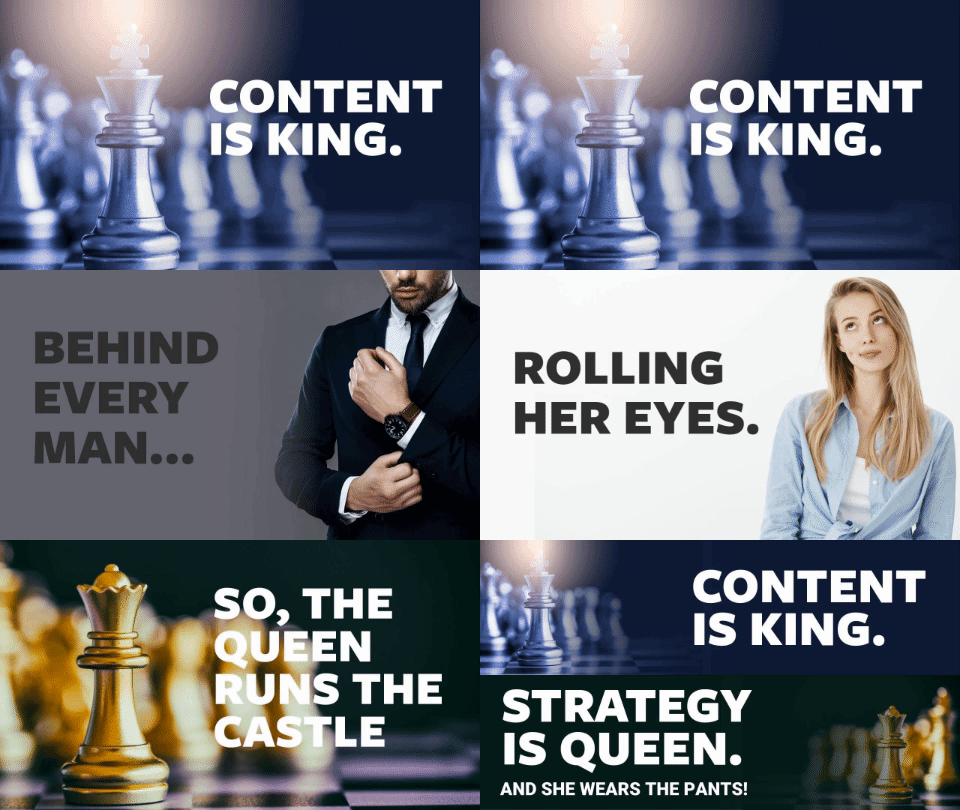
Content is King
Content is the stuff on your site. Typically videos, images, and words. And the more useful and relevant it is to your audience, the more likely your site will perform well. Sure, a video of a monkey riding a lamb and kicking a football into a goal is cute, but it probably doesn’t have much relevance to what you do. Unless you make it relate. “Hop on the lamb and score at our unexpected sale, one-day only!”
The original is always the best
At least that’s what stubborn old people like to say. But unlike Batman and Ocean’s Eleven—that we can all agree got better later on—original content is unequivocally the best content for your website. Original content simply means that it’s not copied from somewhere else. It’s pictures that you take, videos that you star in, and articles written specifically for you.
That doesn’t mean you can’t use information from other sources. Linking out to an article with similar information can even be helpful, but it’s important to extract information and rewrite it for your audience using original wording. Think of it like writing essays in school; plagiarism, citing sources = good!
Customise, don’t compromise!
Your site design gives an immediate impression about your business. A tacky, homemade site with weird colour combinations and misaligned elements you made for your first assignment in an Intro Web Development class shouldn’t be used for your professional business. A bad design will kill your site—unless it’s so bad that it gains legendary status, like Arngren or LingsCars.
You might be thinking that maybe you should try that route and throw design principles out the window… But think of how many others with weird designs failed along the way. Yeah, not worth it.
Design is about aesthetics and usability
Good design isn’t all about appearance. A pretty site filled with broken links and no good way to get to other pages won’t perform well, because big brother (a.k.a. Google) is watching. You can’t neglect the appearance either. Ugly-looking sites are an immediate bye-bye for nearly two-thirds of consumers.
A lot of templates on web-building sites look nice at first glance, but use one and you’ll quickly find the limitations. You’re limited to certain colours. You can’t change picture locations. Or sizes. The ugly font choice is locked in. And so on. These template sites aren’t bad for a personal blog or a tiny, single-person side hustle, but as a site for your main business, getting a custom design is the much better option, especially if you want to grow and expand.
Is your site structure natural and intuitive?
Over the years, we’ve gotten used to expecting certain elements on a page. Like clicking on the logo to go back to the home page. Or that little down arrow that will expand content without taking you to a new page. Or highlighting menu elements on hover and showing a preview of the drop-down list. And plenty, plenty more usability features that are nearly ubiquitous these days. Forgetting one is annoying. Two, irritating. But a bunch? Might as well tape a picture to a cardboard box with a computer screen drawn on it for all the good your site will do.
Content + Design + Usability = Unsucky Site
So if your website isn’t converting, the solution is straightforward; make it less bad. And more good. Sure, it’s straightforward, but not necessarily easy—it requires an investment of time, effort, and usually some dollars as well. How do you do it? Create original, useful, relevant content (Or have a writer create it for you). Fashion an attractive, pretty, well-designed website (Or better yet, have a designer fashion one for you). Build an intuitive, friendly, navigable website (Or have a web developer build it for you).
Or of course, you can always leave it all to the experts.


