Are websites getting a passing grade in 2024?
Interested? Keep on scrolling to read the full e-book!
Don’t have time to read it now? Click the ‘Get my eBook’ and we’ll send you a pdf to read in your own time.

Overview
Is your website scoring high, or could it use some improvements? This ebook includes some important metrics to track and watch out for to see if your website makes the grade.
The grades are out for over a million websites!
What makes a website great? And more importantly to businesses, what makes a website bring in new visitors and customers? It used to be that great content and design alone were enough. Today, that alone isn’t enough. Now, websites need to do a bit more to be top of their class.
HubSpot analysed over a million websites to see which websites make the grade. Of the over 1 million websites tested, which ones received passing marks? And where does yours fit?
You can find out by doing a free website audit. There, your site will be graded in each of the four areas. We’ll break down those areas in more detail in this ebook so you can understand where your website is going strong and how it can improve.
1. ARE WEBSITES GETTING A PASSING GRADE IN 2023?
Of the over 1 million websites tested, is the average website getting passing marks or do they have some work to do?
ARE WEBSITES GETTING A PASSING GRADE?
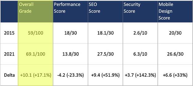
Sort of. The average grade for websites is 69 out of 100. That’s a B-. Okay, but could be better.
Where are websites falling down? In the HubSpot grading experiment, they checked websites against four key metrics and got these results:
Key Website Stats
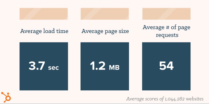
Overall, website improved over the last years on all areas except Performance. On average, the websites analyzed by HubSpot:
- Take 3.7 seconds to load.
- Have a page size of 1.2 MB. Sites in the bottom 25th percentile average 3.4 MB in size, which is almost 1.5 MB larger than the recommended size of 2MB. s Have 54 page requests
The metrics
So if websites are barely passing, how are they getting scored? Websites are scored over four key areas:
Performance
Performance is how well the website works. It doesn’t take things like design into account, but instead metrics like page size, and site loading speed. Performance is worth a maximum of 30 points. A website with the maximum score in Performance will be small and load quickly for the user so will seem blazing fast.
SEO
SEO stands for Search Engine Optimisation and is all the things you can do to your site to make it easier to be found in Google. A lot of people think that when a website goes live, people can search for any related terms and the site will comes up. But with millions of websites up, Google has to prioritise which ones are shown, so doing SEO best practices helps them decide who shows up first. Websites can get a maximum of 30 points on SEO.
Mobile
Mobile devices are now the dominant way that people use the internet. Because of this, it’s essential that your website works well on mobile devices. In fact, Google recommends putting mobile first since more people browse on their phones. But many people do still use desktops and laptops. To solve this, a responsive layout is your best option, and this metric measures how responsive your site is out of 30 points.
Security
Security gives an idea of how safe and protected the site is. The main thing it searches for is an SSL certificate and also checks for potential Javascript vulnerabilities.
2. PERFORMANCE
Performance checks how well your website works. It’s all about what happens in the background to make user experience go smoothly.
How are sites across the web Performing in 2023?
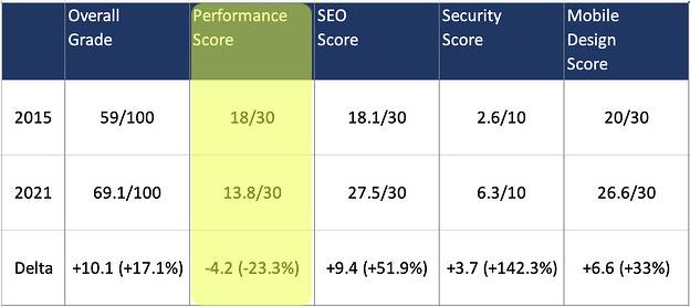
Overall, websites are scoring just 13.8 points out of 30 in performance. This is the only area where the scores dropped between 2015 and 2021. The main reason is that the standards for page speed are much higher than they used to be. And many websites have factors which slow them down. Here are a few standout areas of how they scored:
85% of websites have render blocking
A solid number, but it can be improved. Not sure what render blocking is? Picture driving on a one-lane road. If there’s construction or something that’s blocking traffic in your lane, the obstruction has to be cleared before you can move on. This is similar to how a browser loads a webpage. If the browser encounters an external script (such as a Twitter module or a third party service the website is using), that script must first make a request, load, and finish before the browser can continue to load other assets on the page.
To speed up performance within the context of render blocking, HubSpot has two recommendations:
- Defer any non-critical 3rd party scripts to load after all your core website content. This may extend your Time to Load (TTL) metric, but it will make for a faster rendering experience.
- Remove or make scripts asynchronous so they load in conjunction with the rest of your page.
Just 68% of websites have compression.
This can cover two elements: 1. Uncompressed Images which typically are the #1 source of slow-loading pages and 2. The variable weight of the remaining javascript and CSS resources on the page (WebSite Grader requires that at least 50% of a website’s JS/CSS resources have been compressed).
Compression can especially help browsers load image-heavy pages faster. When a browser is downloading the contents of a website and encounters an uncompressed image, it must download the entire image and then resize the image based on how the website developer had configured it on the page.
Performance Breakdown: Site Speed
Performance is mainly broken down into two areas: Page speed and site functionality.
Page speed is something that is becoming more and more important as average internet speeds increase. Unlike the dial-up days, fast internet has lead to a lot less patience for waiting for pages to load. In fact, about half of people will leave a site that takes more than 3 seconds to load–unless they really need to load that specific page. Otherwise, Google has plenty of other options they can try.
There are a lot of factors that determine page speed. Page size is one of the most straightforward. The larger and more data the page has, the longer it takes to load. Having videos embedded instead of loaded directly from the site is one of the biggest ways to reduce page size. Image size is directly related to this. Large, high-resolution images can bring page loading to a crawl–and they get shrunk automatically anyway!
Page Requests is another factor for page speed. The more requests the page has to make, the longer it takes. Just like you doing one thing is faster than doing it ten times!
Caching stores data from a website on your local device so it will load faster. This means that an image only has to load fully once, then it can pull that information from your phone or computer instead of from another source. Caching does take up space on your device in the long term, and you can empty this out manually to clear some space. However, this will make sites you’ve visited before seem sluggish for a bit while they add the caching data once again.
Minifying might not do much for small sites, but for larger pages, it can be a significant factor. Minifying is clearing out blank spaces in the code. Think of it like the abridged version of a book–it has all the important information but takes less time to get through!
All of these factors combine together to determine your overall Page Speed. This is determined by the number of seconds it takes for the page to fully load. Aim for under 5.3 seconds but ideally you want it to be less than 3 seconds.
Performance Breakdown: Site Stability
Site Stability comes down to how well the site works once you’re on it. Three main factors for this are page redirects, image size, and broken links.
A Page Redirect is when you load a page and it transfers you to a different page. This by itself isn’t an issue and it’s a fairly common practice to have a redirect. An example of this would be landing on the page internet.com/no-meat-and-no-dairy-products-diet and it transfers you to internet.com/vegan . The first page is just a placeholder and doesn’t actually have content.
So why have it all? Mostly this is for SEO, to give your page more power for the keywords like “no meat” and “no dairy products” and the entire phrase “no meat and no dairy products diet”. Having a lot of pages do this, or worse, having a redirect go to another redirect before the final page makes your site less stable and can irritate users.
Image size is important both for site speed as well as stability. If you upload a giant image–like a large 50MB hi-res panorama shot–that full image has to be processed by the user. And the worst part is that the browser they use will resize it anyway, so they have to load the large size and wait for it to compress it to the proper size. Instead, you should crop or compress the image before uploading it to the size you want to speed up loading significantly.
Images size can also be an issue for mobile sites. If the image is too large it might take up too much space on a phone and throw off your entire layout. This can make your site look messy and unprofessional, and can make it difficult to navigate. We’ll go over this more in the Mobile chapter.
Finally, broken links are links that lead to a 404 Page. One of the most common reasons for this happening is when a page is unpublished or has the URL changed and the link leads to the old address. These can be especially irritating for users when they’re keen to read something that you link to only to find it doesn’t exist. Doing regular checks of your site to minimise broken links is a good practice. Fortunately, it can be done automatically through many tools on the web like brokenlinkcheck.com
Glossary
Render Blocking: Render blocking is when there are scripts that have to be loaded before the page can fully render (load for view). Render blocking can greatly slow down loading speed and make your visitors wait longer.
Uncompressed Images: Uncompressed images are much larger and then have to be shrunk down to the right size before showing to the user. Already having the images at this size reduces the size of the site and also removes the step of shrinking the images, making the site faster.
Page Size: The amount of data on the page. More data leads to a “heavier” page which takes longer to load.
Image Size: The amount of data in your image (usually MB). The bigger the image and more resolution the longer it takes to load. Compressing images can speed up page load speed.
Minifying: Removing blank space and unnecessary characters from the code to speed it up. Minifying is great for loading but not for making code or for people to read it, so it’s ideal to be able to switch back to unminified for adjustments.
Caching: Storing frequently used content on your local device. This is typically images, where a copy is saved for fast loading from your device instead of from server requests.
Page Speed: The number of seconds it takes to load the page. The faster, the better!
Site Stability: How stable a site is. Metrics include Minimal page redirects and updated links
Page Redirect: Landing on a page that immediately transfers you to another page on the same site or a different website.
404 Page: The default page you are taken to when the URL doesn’t exist. Usually it will say something like “Page not found”.
3. SEO
SEO is all about getting found on Google when someone types in your site’s name, products, or services.
How are sites doing with SEO in 2023?
SEO has seen a massive increase in the last few years thanks to many website platforms having the basic structure built-in. This means to perform in SEO in 2022, you need to put more effort in because the minimum bar has been raised.
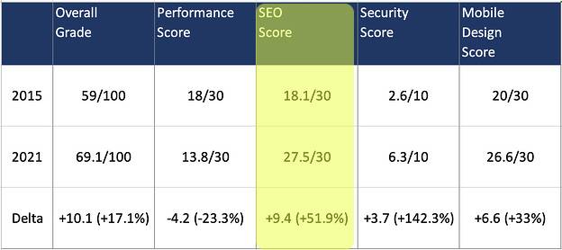
Over 50% improvement
SEO was the big winner, and more people are learning about how important SEO factors are. So to outpace your competitors, you’ll want to aim for max points in the SEO category or you might be left behind.
What is SEO?
If you’re unfamiliar with SEO, you might think that if you have a cafe and put up a website and type in “Cafe”, you’ll show up right on top. But when there are 50 cafes that all have websites and are all in the same city as you, you can quickly see why it isn’t as straightforward. There’s only 1 top spot in Google; how do they decide who gets it?
That’s where SEO comes in. SEO is basically all of the things Google looks for to determine ranking order. And as the most visited site in the world, being top on Google brings a massive boost to your site’s visits. So what do you need to do? There are actually over 200 factors that go into SEO–that’s a lot! Some of them include having Meta Descriptions and Descriptive Link Text. If you’re interested in learning more, we have an entire ebook dedicated to it you can read and download for free: All About SEO ebook.
Glossary
SEO: All of the factors and elements your website needs to rank high in Google.
Meta Descriptions: Descriptions of your page that show up in Google Searches. Both Google and potential visitors see these when searching on Google so it’s important to take the time to write useful, relevant information here.
Descriptive Link Text: Having the text of links describe what the page you are linking to is about. So “All About SEO ebook” linking to the page instead of the text “https://www.back9.co.nz/ebook/all-about-seo/” that links to the page.
4. MOBILE
Most internet searches are done on phones these days, and the Mobile rating is all about how well the site works on phones.
How are sites working on Mobile devices in 2023?
Since Google rolled out their Mobile First initiative a few years back, it’s essential that your site works on mobile devices or it will also be punished on every other category except for Security. So how are websites doing in 2022?
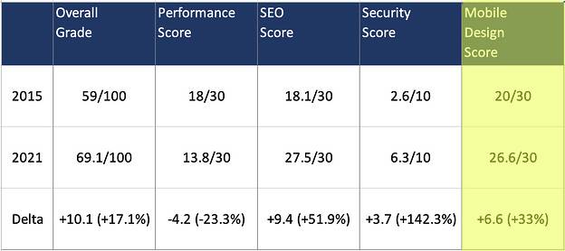
Mobile sites improve
Like with SEO, most website platforms have also stepped up their game when it comes to how the site works on mobile devices, with a 6.6 point average increase. Historically, websites were developed for laptops and desktops and phones and tablets were an afterthought. Even many major corporations didn’t bother optimising their sites for mobile.
This led to sites that worked fine on your computer or work computer, but that were slow, buggy, or simply didn’t work properly on your phone. In 2015, many companies were still using specific mobile or M-Dot sites, separate versions of the website you were redirected to if you were on a phone.
But as phones with internet access gained wider adoption, mobile devices are now used more than desktops for browsing the internet. In the last several years, this massive shift has changed the way that developers build websites. While sites are still built mostly on more powerful desktops, optimisation for mobile devices is now a crucial aspect of the design and development site. This has led to the rise of mobile responsive sites that work just as well, if not better, on your phone or tablet than on a computer.
Mobile Break Down - Responsiveness
There are three categories for grading mobile optimisation: Font Size, Tap Targets, and Responsiveness (which technically encompasses the former two as well).
On mobile devices, having the wrong font size can be a huge problem, often literally; fonts that are too big can drag off the screen or break apart single words into separate lines. Because of this, setting a font size like “24 pt” is no longer the gold standard. Instead, developers have moved on to clever solutions using ratios so that the font only fills up a certain percentage of the screen no matter what the screen size is.
Tap Targets are any element on the screen that the user interacts with. What websites are graded on in this section is that these elements aren’t too small or too close together. If they are, a user might accidentally click on the wrong thing. If this happens to be on a page they were entering information and tapping the wrong thing takes them somewhere else and coming back makes the user restart the process, some will simply give up instead of redoing their work. Aim for large, distinct tap targets that are obvious they are interactive to maximise your score here.
Responsiveness means that the design of the website is flexible and adjusts depending on the screen size. Image and font sizing are two important aspects of a responsive website. You don’t want the font to be too big or too small, and the same goes for your images. On responsive websites, the layout often switches up to accommodate whatever screen size you’re using. For instance, on a desktop there might be a gallery that has products setup in 3 columns with pictures and descriptions beneath the image. But on mobile that might adjust so that there is only a single column where the next product and description set goes below instead of beside the previous one.
Responsive websites are easier to use, look better, and are also rewarded by Google through a boost in rankings, so make sure to take the time to do it right!
Glossary
M-Dot Sites: A website designed for mobile devices that exists on a subdomain and starts with “m.” m.facebook.com is an example.
Tap Targets: Any interactive element on a mobile website. These are things that can be “tapped” and something happens like taking you to a new page or opening a pop-up.
Responsiveness: A flexible website design that adjusts to the screen size of the device being used including font and image sizing and design layout.
5. SECURITY
Security is all about keeping your site, your information, and your customer details safe from hackers and other bad players.
How Secure are sites in 2023?
It used to be more complicated to know if a site was insecure. Now, most browsers will show a warning when a site fails some of the basic security checks that have become standard. Sometimes, you have to take extra steps on warning screens to even access websites your browser thinks are insecure. This means you’re much less likely to be tricked by malicious websites than you were a few years back.
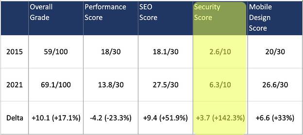
Security has gotten stronger
Security has seen a slight increase over the dangerously low levels it was at in 2015, but there’s still improvement to be made for sites across the web. Since a flaw in your security can compromise your website and all its data, you should aim to score as high as possible in this area.
How do you keep your site more secure?
There are several ways to make your site more secure, but the two main ones are through SSL Certificates and Secure Javascript Libraries, which were checked when giving these websites their grades.
An SSL Certificate encrypts data transferring between a user and the website so it can’t be intercepted and read during the transfer. This basically means that if the data is intercepted, it won’t be readable because it will be encrypted and impossible to decipher. If a site doesn’t have an SSL Certificate, you run a risk of someone taking that data and using it how they wish.
You can tell if a site has an SSL Certificate by looking at the URL. If it starts with “https” instead of “http”, then it’s secure. In fact, that’s all the s means — http secure. Browsers like Google Chrome will also show a little lock icon to the left of the website address if the site is secure as a quick visual so you know it’s safe.
A Secure Javascript Library is one that is up to date with the latest security features. Each version of Javascript comes with security protocols, which are generally updated when someone discovers an exploit to get around security. Keeping these up to date will greatly decrease the chance of getting your website hacked.
Glossary
SSL Certificate: A certificate that encrypts your website so that any submitted data isn’t visible to third parties like hackers. It protects personal information and payment details from being viewed by non-authorised users.
Secure Javascript Library: An up-to-date Javascript library with the latest security updates and protocols
6. GETTING A PASSING GRADE
Now that you know what each area is, it’s time to put it all together. What does it take for a website to get a “passing score”?
What's a passing score?
If you use the common NZ University grading system, you can add up your points to see if you pass. This website grader has a maximum of 100 points which makes calculating the percentage easy as!
How are the top websites performing?
As you can probably guess, some popular websites score really high marks. At one point HubSpot, the people behind the grading tool, scored a remarkable 97. However, even their score has dropped, and as of May 2022 it sat at 85, with the website missing points on Performance.
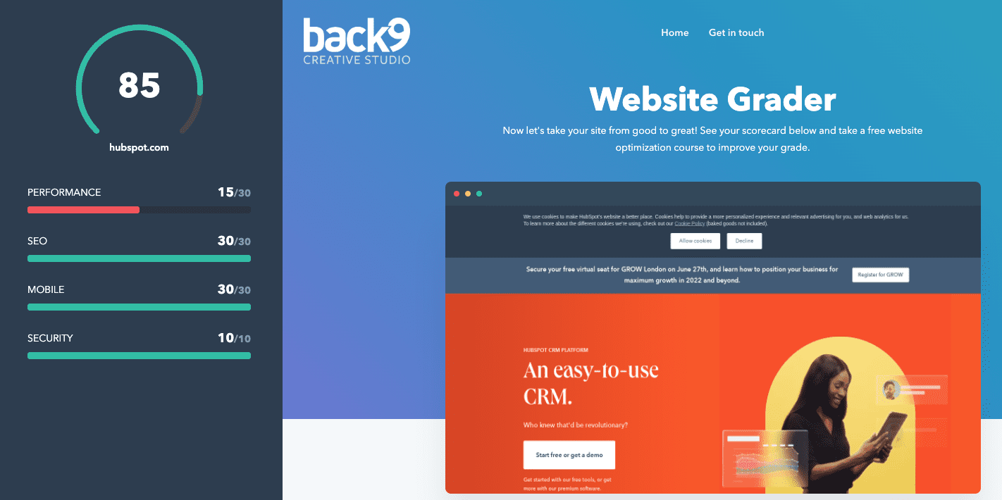
What’s a good score?
If you take a look at the colour of the circle by the score on the image above, you’ll see that it’s in green. And green means good! Here’s an overall breakdown of scores:
- 80+ — Green — The website is good
- 50-70 — Yellow — The website is okay but could improve
- Under 50 – Red — The website needs work
Just like University, getting under 50 is a failing grade, so you want your site to do better than that!
Wahoo! Thanks for reading, champ!
If you’ve got some questions or feedback get in touch with us today.
Contact us


